

.png)
Company
Dr. Mèsi
Role
Product Designer, The Brink Agency
Duration
9 months
Dashboard design and user research
for Dr. Mèsi, a medical application aimed
at improving patient-doctor communication
✴ Product design ✴ User Research ✴ Med-tech
Dr. Mèsi is a startup aimed at improving access to medical care in Guadeloupe, a underserved town in France. The platform connects patients with doctors through virtual consultations, addressing the challenge of limited medical access in the rural area while making sure the prices remain economical.
I was responsible for creating the experience principles, Sitemap, user personas and prioritisations. I was also one of the UI designers in control of creating the Interface of the website dashboard for all personas.
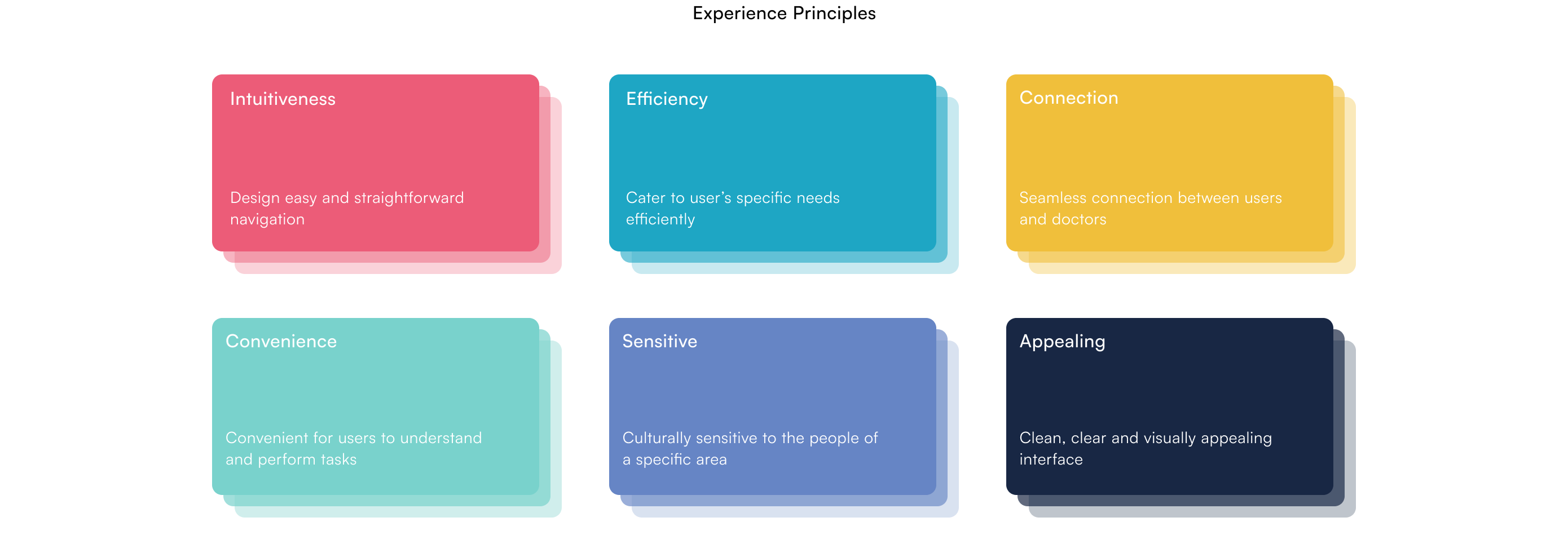
I interviewed the stakeholders and cleared out initial assumptions. With a clear mission in mind, I worked on developing experience principles to set our product aspirations.
In Guadeloupe, limited healthcare access and communication gaps create challenges for both patients and doctors. Patients often struggle to understand medical information, while doctors face difficulties in tracking patient histories across fragmented systems. This lack of streamlined communication reduces the quality of care, delays critical interventions, and prevents effective patient-doctor interactions. Dr. Mesi aims to bridge this gap by providing a centralized platform that simplifies communication and enhances access to medical services for diverse user groups.
Once user research was done we moved on to prioritisation of the features as per the MosCow model of prioritisation.

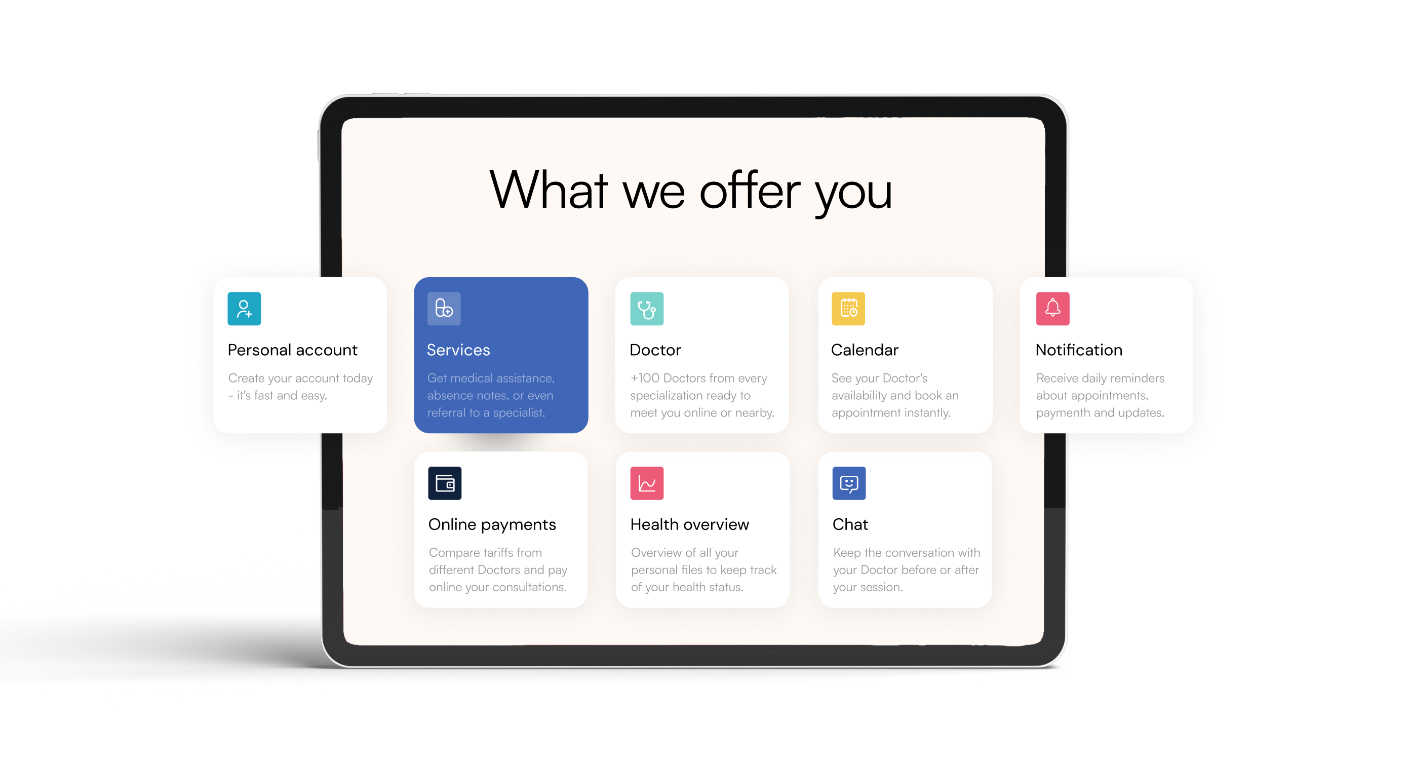
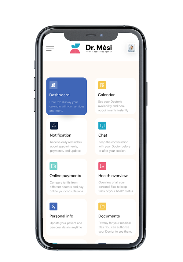
Creating distinct dashboards was essential to ensure that the tool met the unique needs and experiences of each group. Each persona interacts with the healthcare system differently, so tailoring the dashboard allowed us to address specific pain points and streamline their processes.
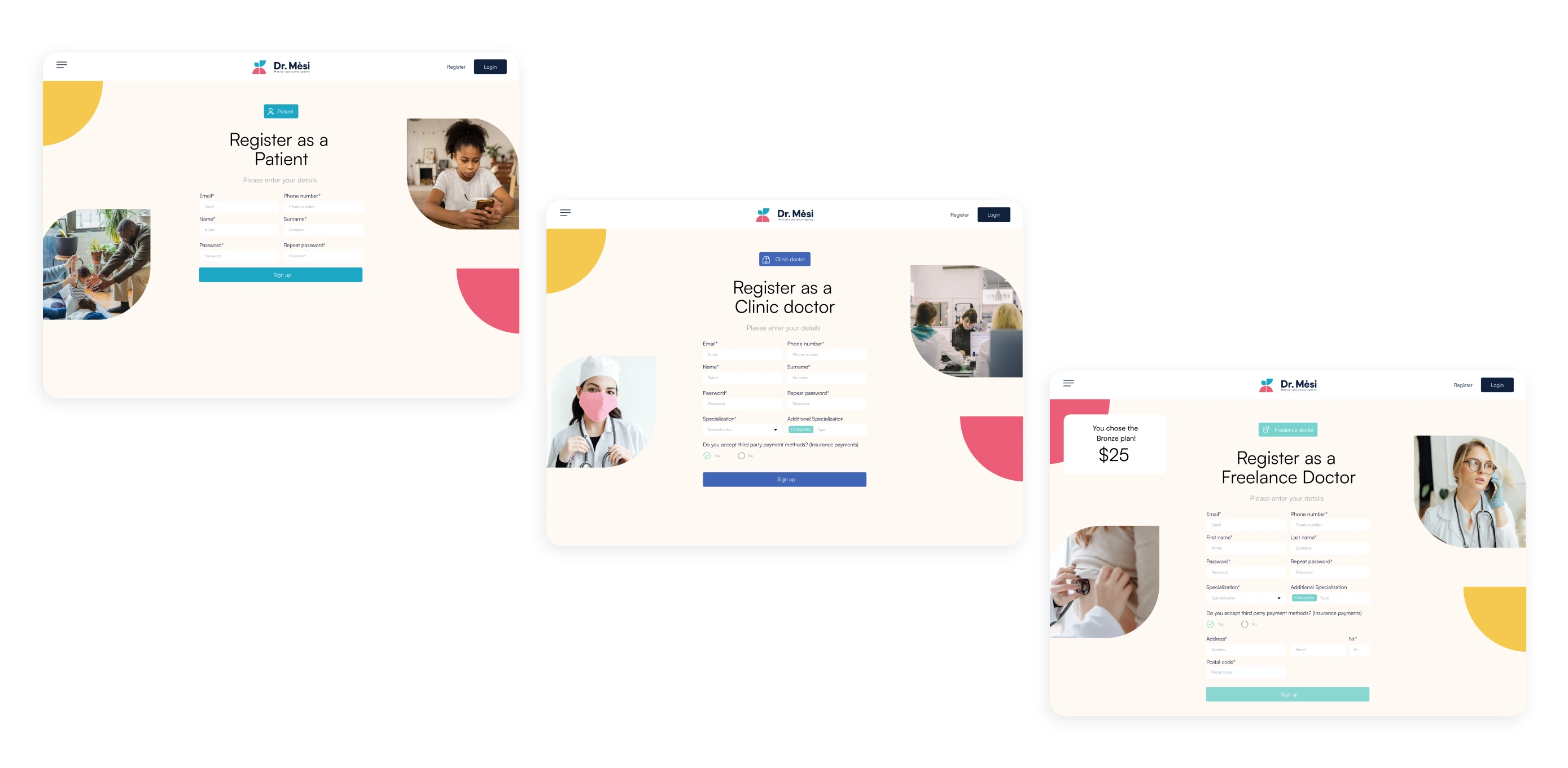
For Doctors - The dashboard prioritized quick access to patient histories, schedules, and communication tools.
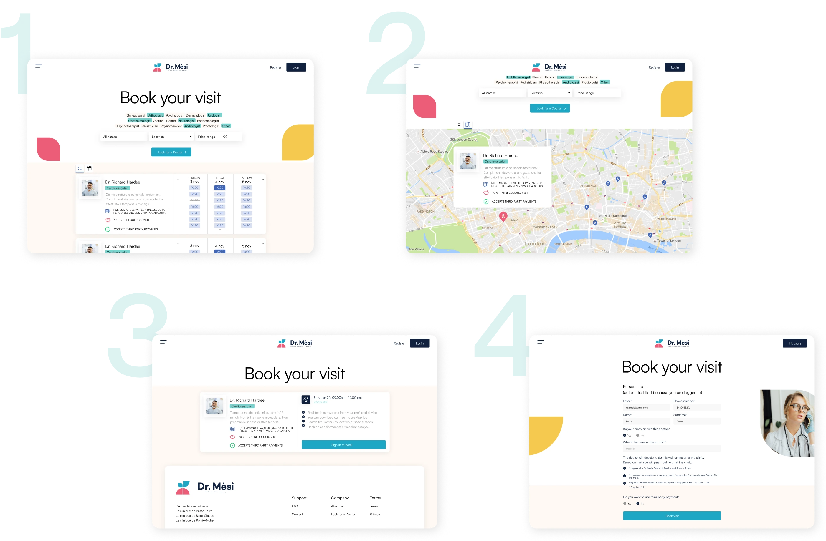
For Patients - emphasized appointment booking and health management. By designing separate flows, we created a seamless experience that minimized friction, allowing each user type to interact with the platform intuitively and effectively.
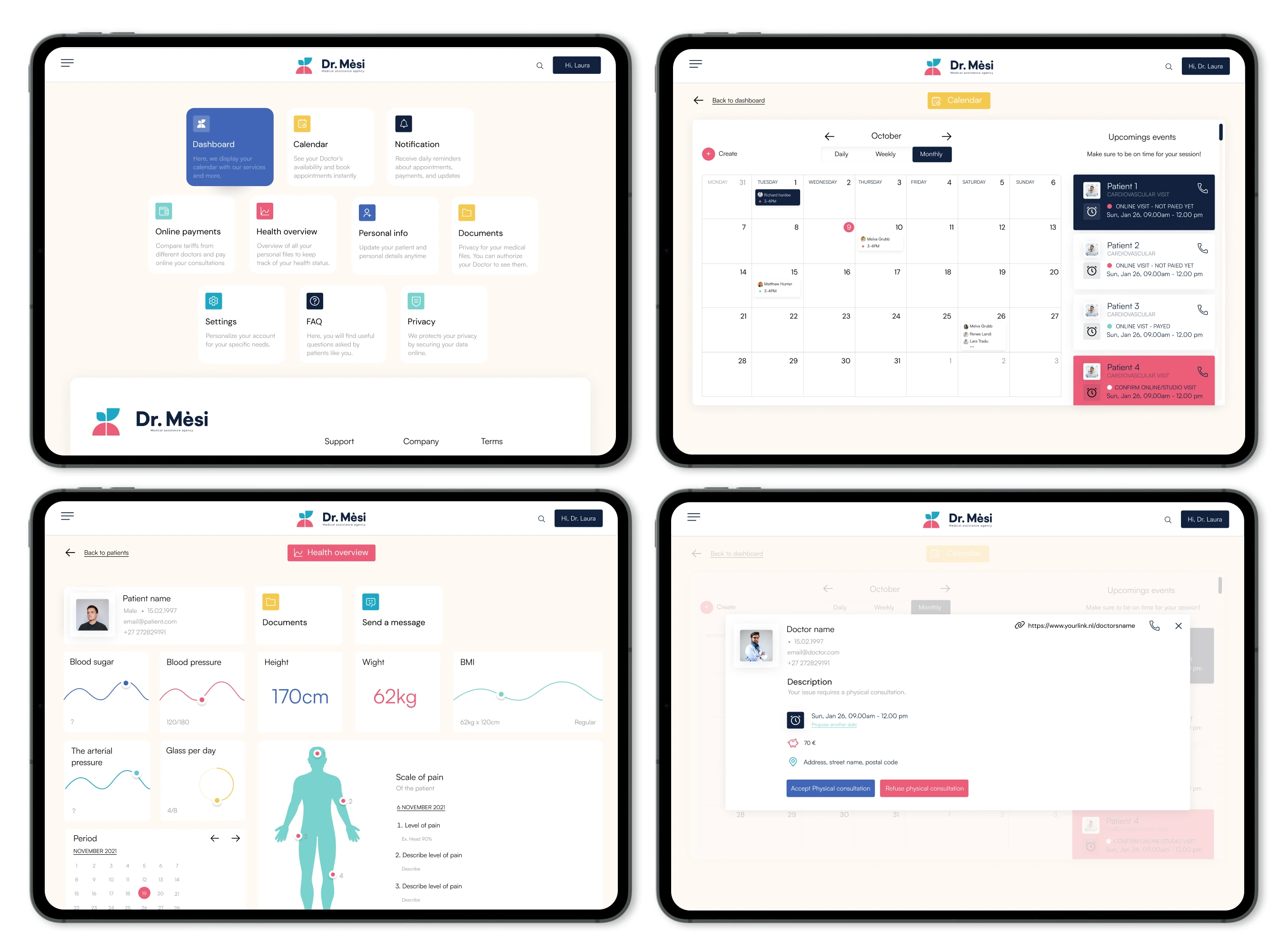
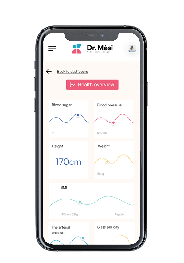
One significant challenge was simplifying complex medical information for a diverse user base with varying levels of health literacy. Ensuring that medical data was accessible yet comprehensive required careful balancing of terminology, visual elements, and layout.
To overcome this, we incorporated tooltips, plain language summaries, and visual indicators that helped demystify medical terms without oversimplifying critical information. The goal was to create a platform where patients felt informed and empowered, and doctors could communicate clearly without extensive clarification.
Recognizing that ease of use is crucial, we ensured that patients could search by specialty, available times, or location, then book appointments directly. Notifications confirm appointments and provide options to reschedule if needed. This feature is designed to make the booking process efficient and reassuring, allowing patients to manage their medical engagements with confidence and minimizing missed or delayed healthcare opportunities.
The color scheme and typography in this design adhere to WCAG standards to ensure a user-friendly and inclusive interface for all users.
Throughout the implementation phase, I worked closely with the developers, addressing any questions they had about design elements and providing clarification to ensure alignment with the intended user experience. I remained involved until the final product handoff to the client, conducting QA sessions with the developers to verify design fidelity and accessibility compliance, ultimately ensuring a seamless transition from design to development.
A key takeaway was the importance of designing for diverse user needs within a single platform, balancing both technical and accessibility requirements. By designing distinct user flows and dashboards, I learned how crucial it is to prioritize usability for each persona to ensure a seamless experience.
Working with developers to address real-time design challenges taught me the value of flexibility and collaboration. This project showed me the impact of thoughtful, user-centered design in bridging communication gaps and making healthcare more accessible for underserved communities.