
.png)
Team
4 members
Role
UX Reseacher and Product Designer
Duration
5 months
Reimagining MIT Libraries' homepage
and information architecture to improve
the search functionality and navigation
✴ UX Research ✴ Usability testing ✴ Wireframing & Prototyping ✴ Tree Testing ✴ Card Sorting
Students, faculty, and researchers at MIT were struggling to navigate the library’s complex and dated website. With scattered resources, overwhelming menus, and limited search clarity, users found it difficult to locate scholarly materials, research tools, and archives efficiently. The challenge was to simplify the information architecture and homepage experience to make knowledge more accessible, intuitive, and user-centered.
My role was to gain insights of users’ needs and pain points as well as current problems on the MIT libraries website to develop user-centered design recommendations for the website's redesign (of homepage and navigation) with concrete rationale.
✴ Improve Search Clarity - Help students and researchers search more effectively by simplifying and clarifying the multiple search options available on the website.
✴ Streamline User Flows - Reduce drop-off by creating clearer pathways and minimizing steps needed to access high-demand resources such as research experts, class guides, and theses.
✴ Support Institutional Priorities - Highlight the library’s strategic offerings and business needs through more intentional placement and visibility in the design.
✴ Literature Review
✴ Analyse MIT's existing research on the issue
✴ 20 Competitors analysed
✴ Moderated Interviews
✴ Card Sorting
✴ Usability test - Moderated and Unmoderated
✴ Tree Testing
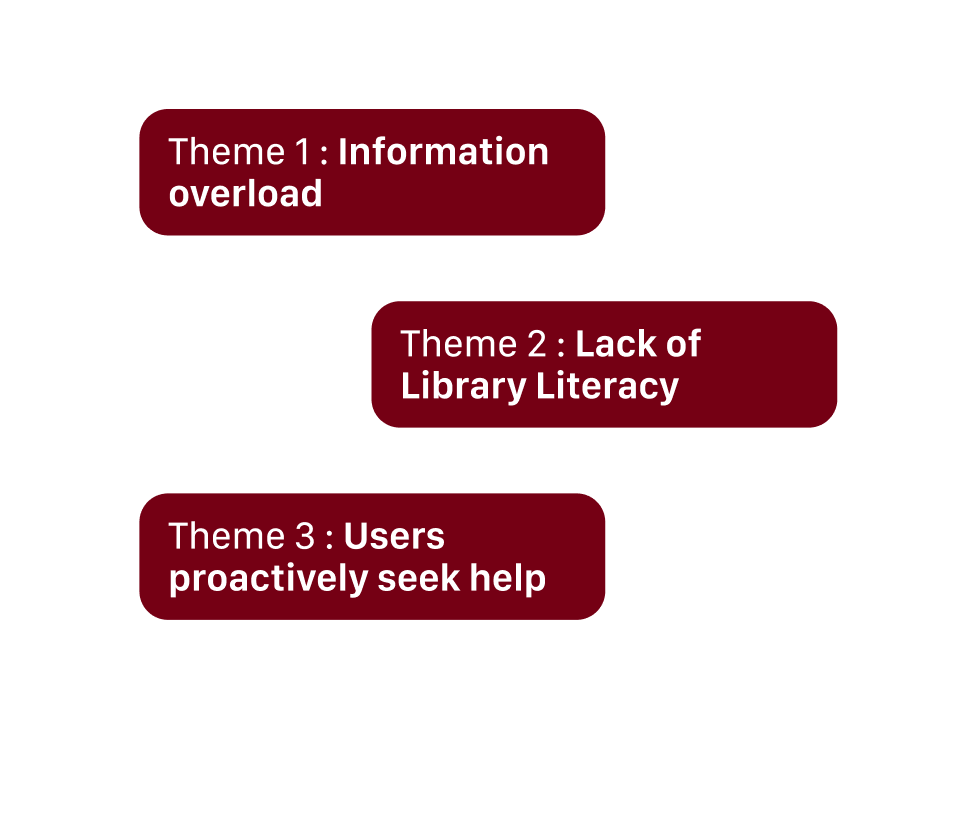
↳ Information Overload
Library websites are confusing for students, faculty and staff to navigate
↳ Lacking Library Literacy
Users don’t know how to start and proceed with their search. Users may not know the best databases to use
↳ Seeking Scholarly Support
Users need support in managing all the information and citations that they collect. Users feel a lack of support from institutions to help them conduct and find research
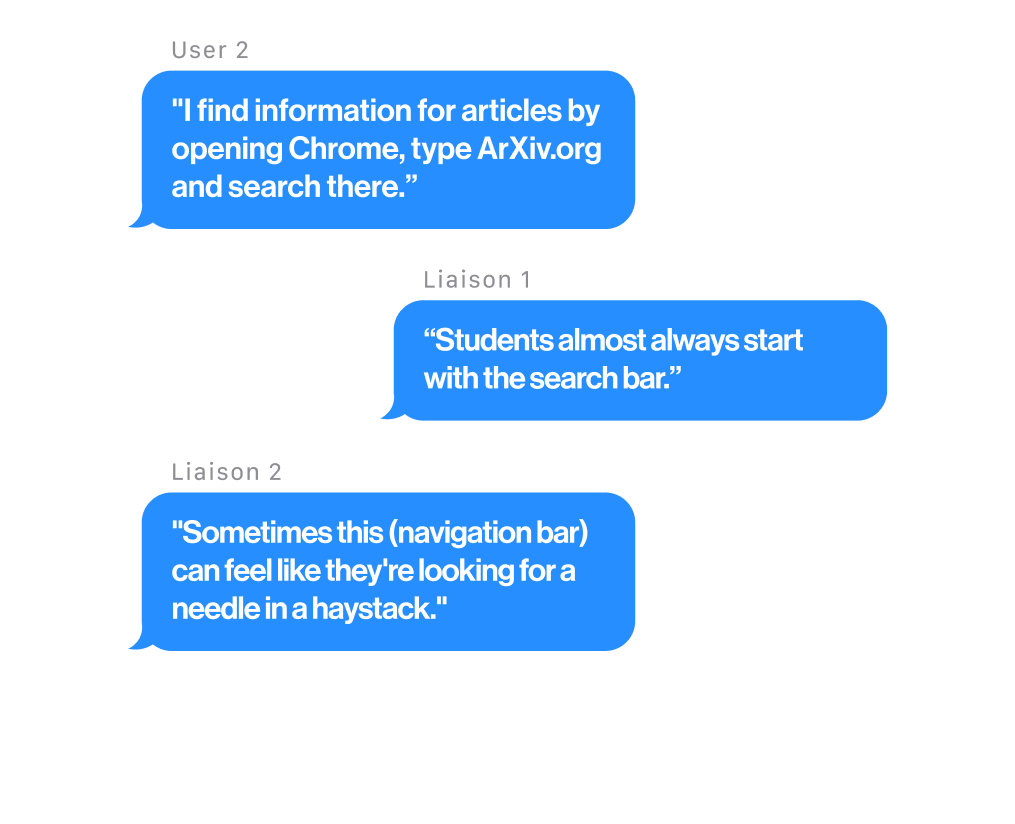
↳ Most users begin their search the way they would on Google - typing into the library’s search bar with the expectation of simple, accurate results. Instead, they encounter unfamiliar “Bento” search results, causing confusion and difficulty locating known items.
↳ Confusing Nomenclature Makes Navigating a Challenge. Important resources like class guides, theses, and standards are hard to find, often requiring too many steps. Users usually discover them through liaisons, highlighting poor visibility.
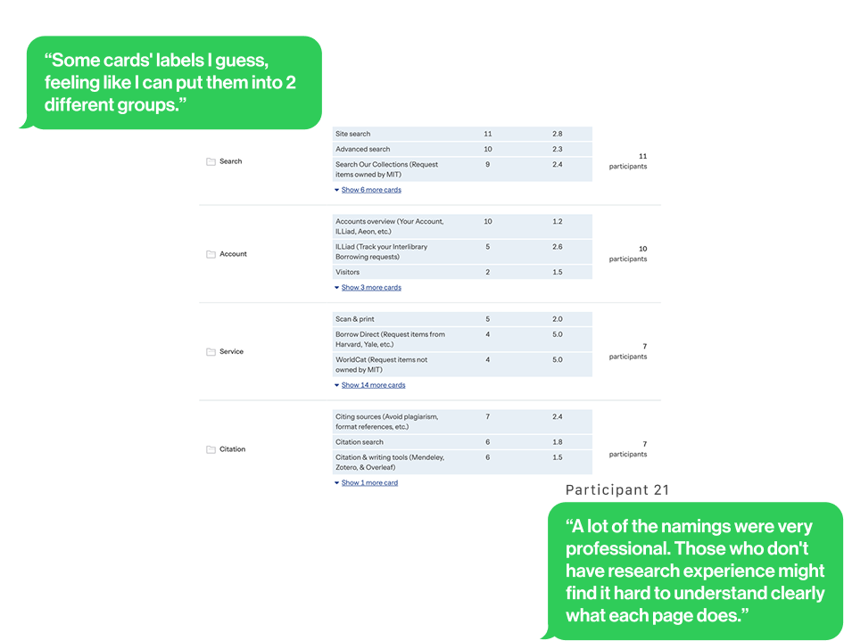
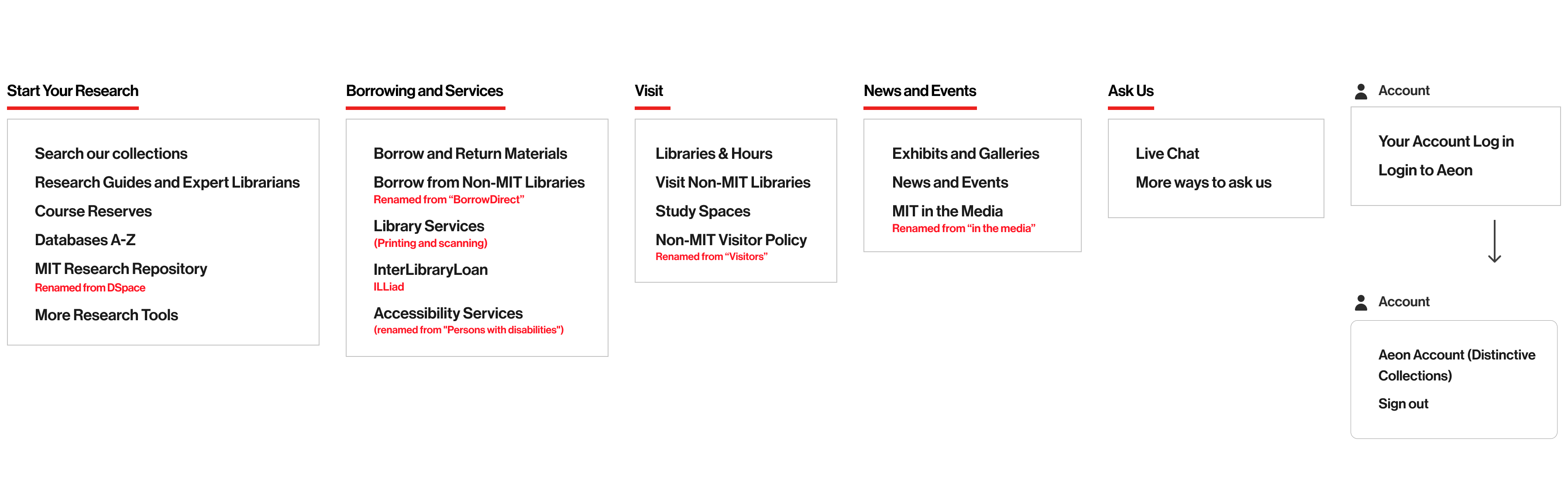
We used card sorting to reorganize the navigation, grouping items into clearer, more intuitive categories.
↳ We realized users group labels with common tasks on the library website such as Search, Account, Service, Citation, Research, About , and Borrow.
↳ Library-specific nomenclature used without context was hard to understand
↳ Some card labels could belong to multiple categories
↳ The Search Process Often Starts from the Search Functions or “Ask Us”
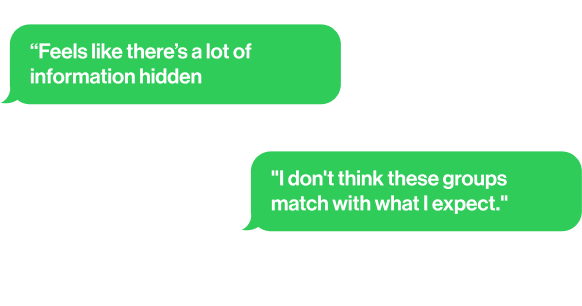
↳ Users Felt Unsure When They Didn’t Know Which Navigation Tools to Use
↳ Several pathways for completing tree test tasks were indirect, highlighting user confusion with the organization of the navigation bar and a lack of user confidence in navigating it.
We conducted moderated usability tests on 10 users
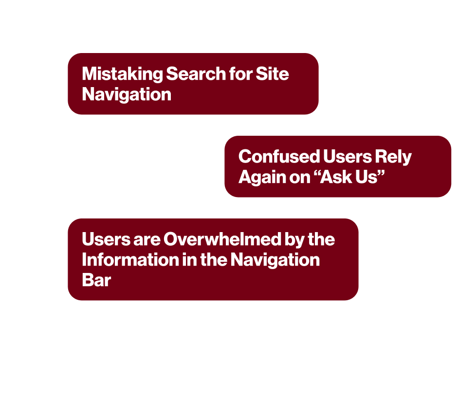
↳ Users often mistake the Bento search for site navigation and use the library website like using google
↳ It was common for information seekers to get stuck while looking for information on the website. Those who did seek help overwhelmingly relied on the Ask Us chat function for immediate support.
↳ Users are Overwhelmed by the Information in the Navigation Bar
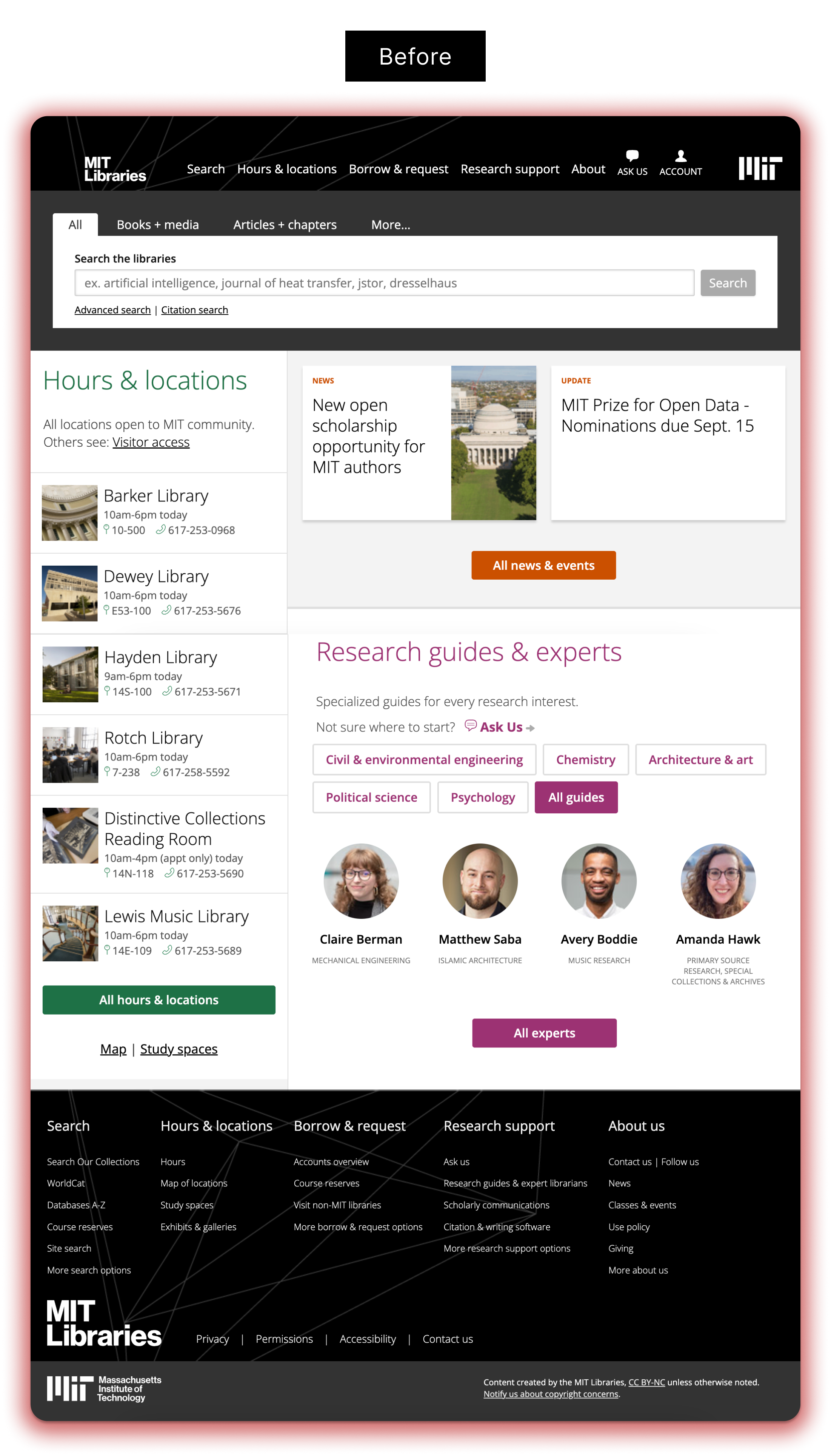
The Solution
From our usability testing and tree testing, we found that users struggled with the current navigation menus, which often felt overwhelming and cluttered. This led to hesitation, reduced confidence, and extra time spent trying to locate information.
Meanwhile, insights from interviews and usability testing revealed that the information architecture labels were unfamiliar, academic, or vague, making content harder to understand and reducing findability. Together, these findings highlighted that both the structure of the site and the clarity of its labels needed refinement to support smoother, more intuitive navigation.
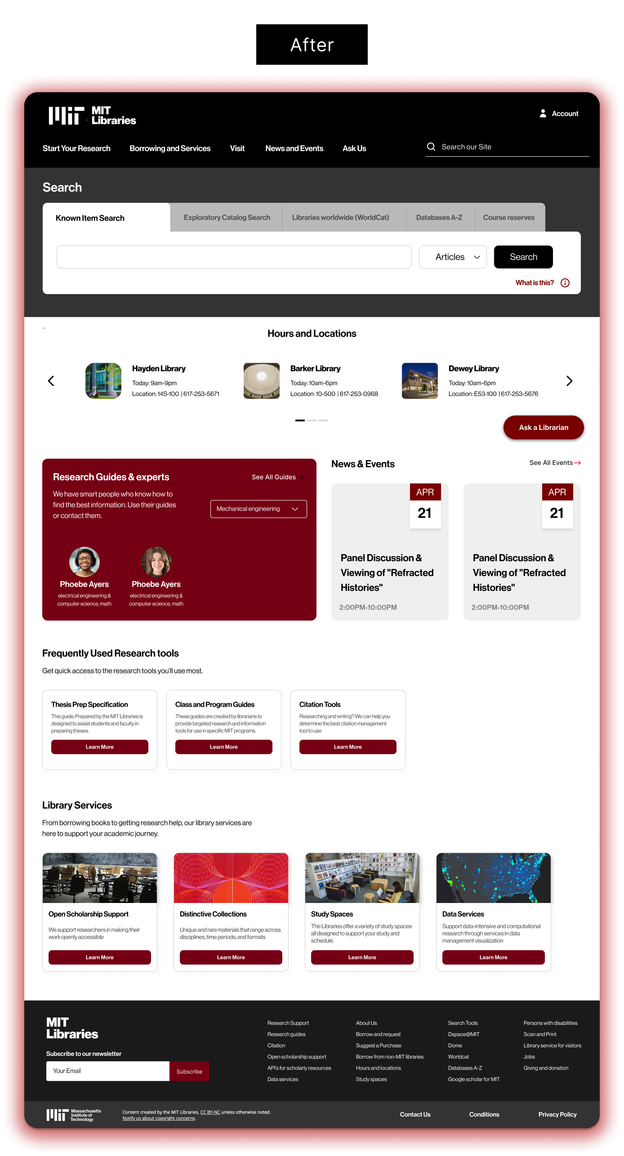
Current Information Architecture →
A restructured navigation system designed around user tasks rather than library terminology. Using the findings from our Card Sorting and Tree testing, I organised content based on what users are trying to accomplish, such as accessing class guides, or getting research help, simplifying discovery and supporting more intuitive pathways through the site. This resulted in a 82% task success rate through usability testing, which was 31% more than the current IA.
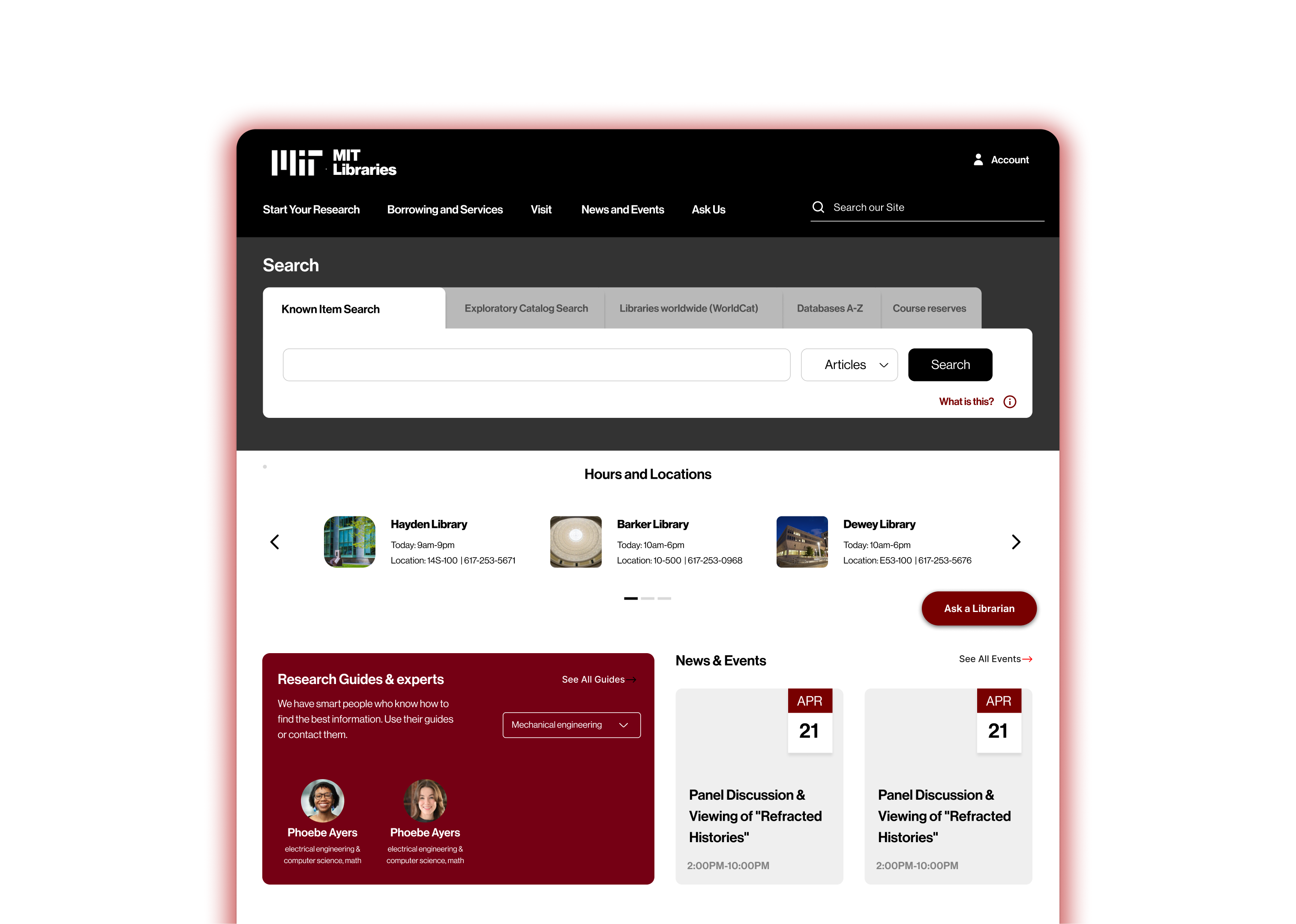
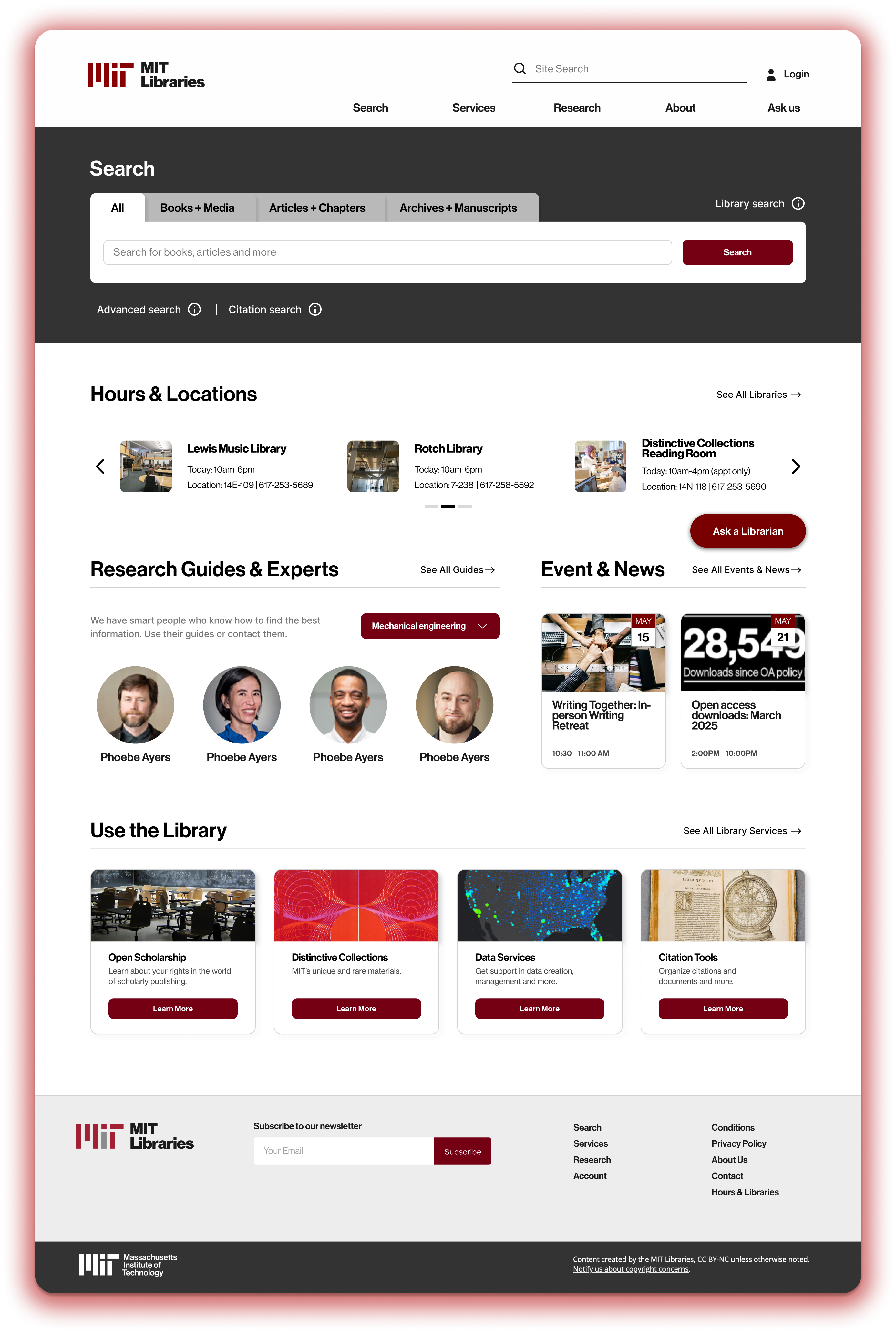
Based on our research, we identified two distinct ways users search on a library website: looking for a specific known item and conducting general exploratory searches. To support both needs, we redesigned the search bar with clearer labels - directing users to Primo for known-item searches and to Bento for broader, exploratory searches.
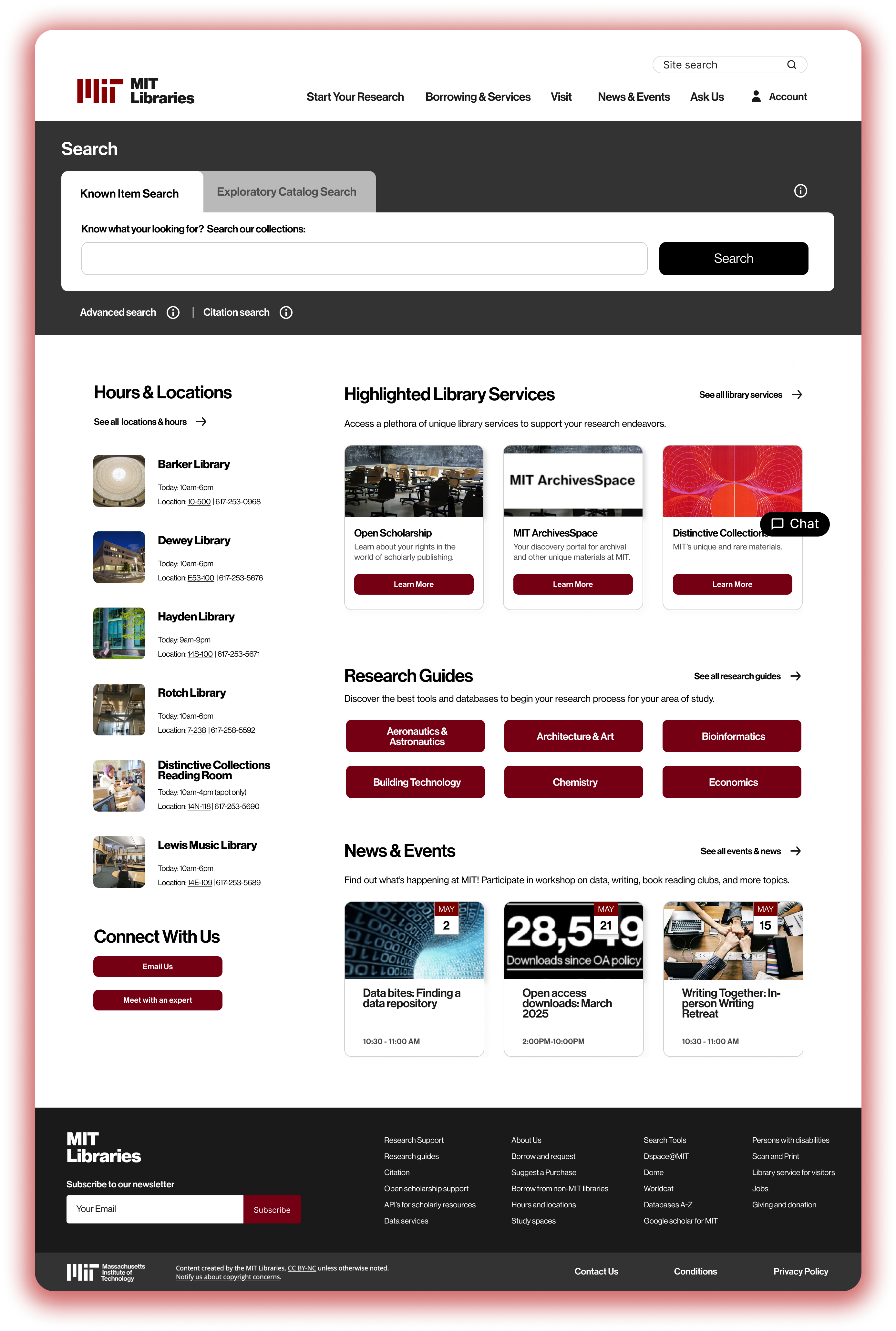
Version 1 emphasizes redefining how users interact with the search bar, while also placing a site-wide search in a highly visible section to make searching more efficient and accessible.
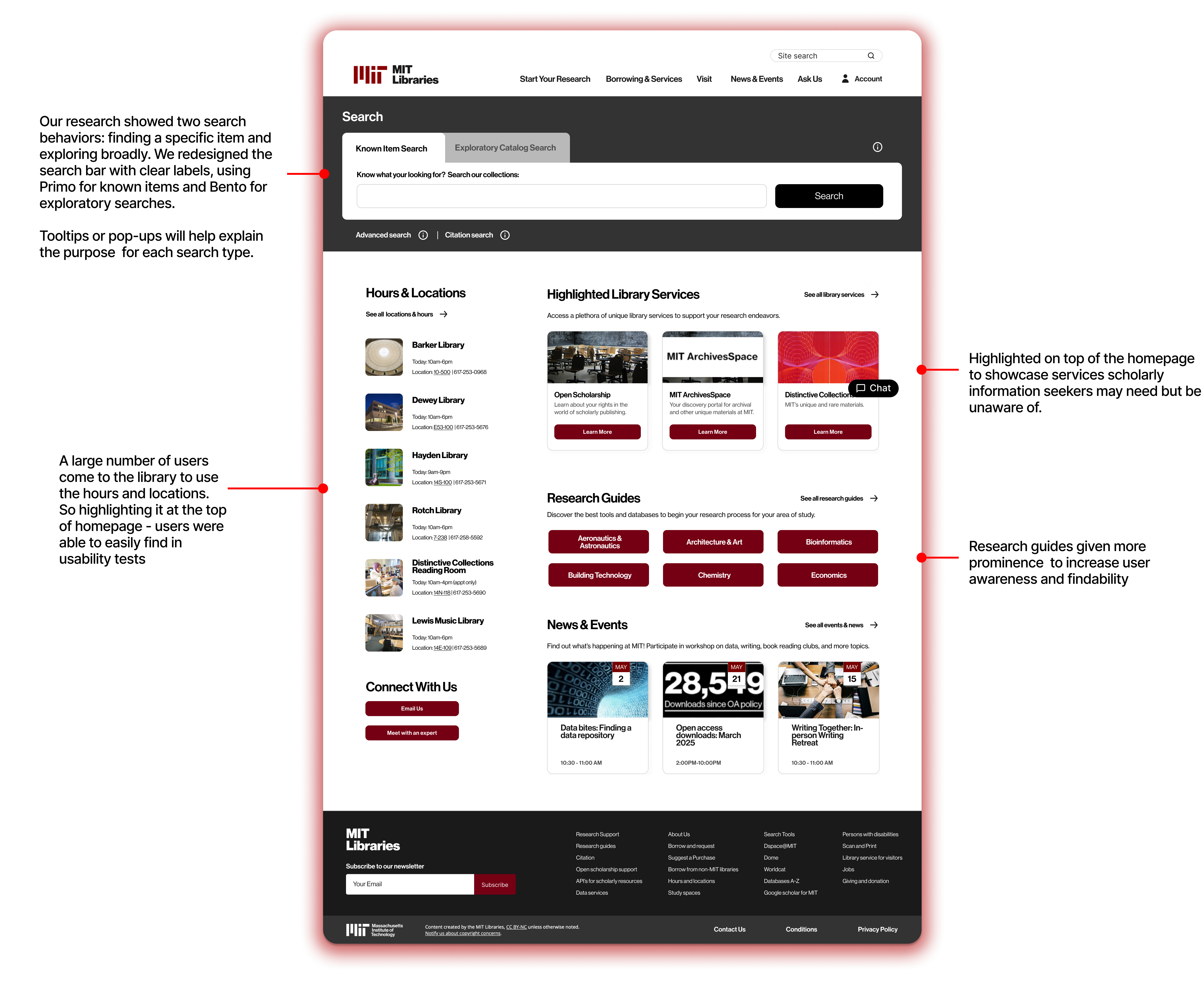
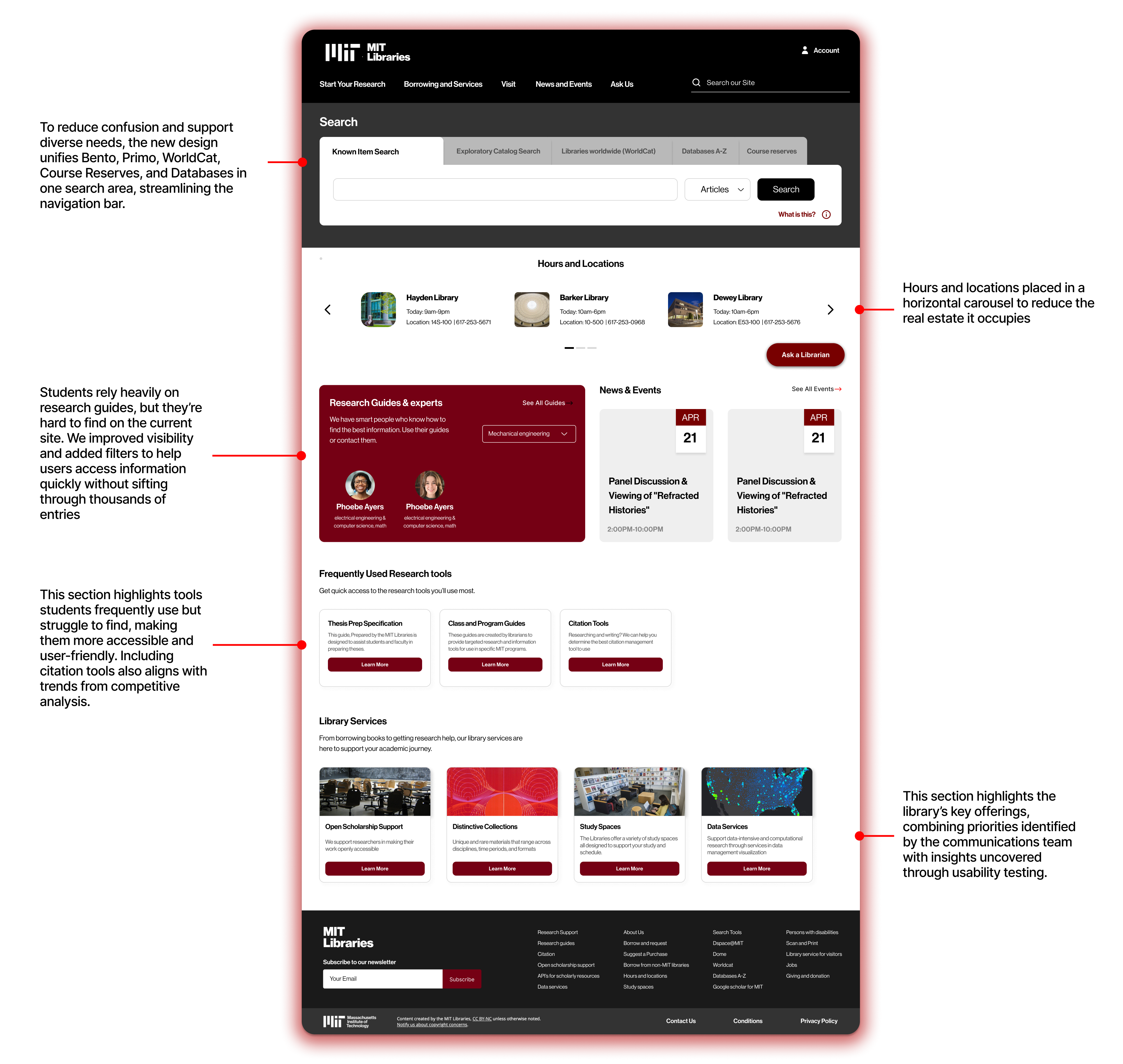
Building on version 1, we focused on making research guides and key search tools (previously hidden in the navigation ) easier to access. Alongside Primo and Bento, we integrated searches for class guides, course reserves, WorldCat, and databases into a single, unified search area. This not only reduces clutter in the navigation bar but also simplifies the experience across multiple platforms.
Since students rely heavily on research guides, we made them more prominent and added easy filtering options, allowing users to quickly find what they need instead of manually browsing through thousands of expert names.