
.png)
Team
4 members
Role
UX Researcher
Duration
5 months
A usability evaluation using eye-tracking
for an AI powered online course builder
tool for Gutenberg Technology
✴ UX Research ✴ Usability testing ✴ Eye-tracking ✴ Heatmaps ✴ Gaze plots


Gutenberg Technology’s Course Builder AI helps educators turn documents into AI-generated course modules. As the product continues to evolve, GT wanted an in-depth evaluation of how well first-time users understand and interact with the tool, especially educators creating a course from scratch.
I served as a UX Researcher, working collaboratively across planning, execution, and synthesis:
My key responsibilties were -
✴ Helped design research scenarios and task flows grounded in real educator use cases
✴ Co-facilitated Tobii eye-tracking sessions, including setup, calibration, and participant guidance
✴ Collected and analyzed gaze plots, heatmaps, recordings, and movement patternsAnalyzed and scored the System Usability Scale (SUS) data
✴ Reviewed Hotjar clips to identify real-world behaviors and session abandonment patterns
✴ Synthesized findings into clear insights and recommendations
✴ Created next-step strategies (A/B tests, version history feature)
✴ Co-wrote and presented the final report to the client.
In this project, I focused heavily on data interpretation, identifying the “why” behind user hesitation and translating abstract behavioral patterns into actionable product improvements.
✴ Identify the biggest usability barriers in the course creation flow.
✴ Understand how users interpret and edit AI-generated content.
✴ Evaluate whether the UI and terminology match user expectations.
✴ Provide research-backed recommendations to improve learnability, navigation, and system transparency.
✴ In-person eye-tracking testing (8 participants, 45–60 minutes each)
✴ Scenario-based tasks reflecting realistic educational workflows
✴ Retrospective Think-Aloud (RTA) after the session to capture intentions and confusion
✴ System Usability Scale (SUS) questionnaire
✴ Gaze plots, heatmaps, and session recordings
✴ Hotjar supplemental sessions for broader behavioral patterns
✴At which step(s) in the Course Builder flow do users get stuck or experience the most
difficulty?
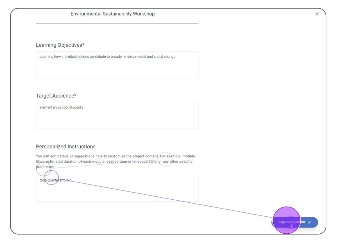
✴ Does the Ul of the Learning Objectives, Target Audience, and Personalized Instructions accurately communicate what should go in those spaces?
✴ Can users parse through the information generated in the modules, and how accurate is it to the course document
provided?
✴ How satisfied are users with the level of control they have over customizing the
✴ Al-generated content?
(RTA) What additional features do users wish they had
when building a course?
The Findings
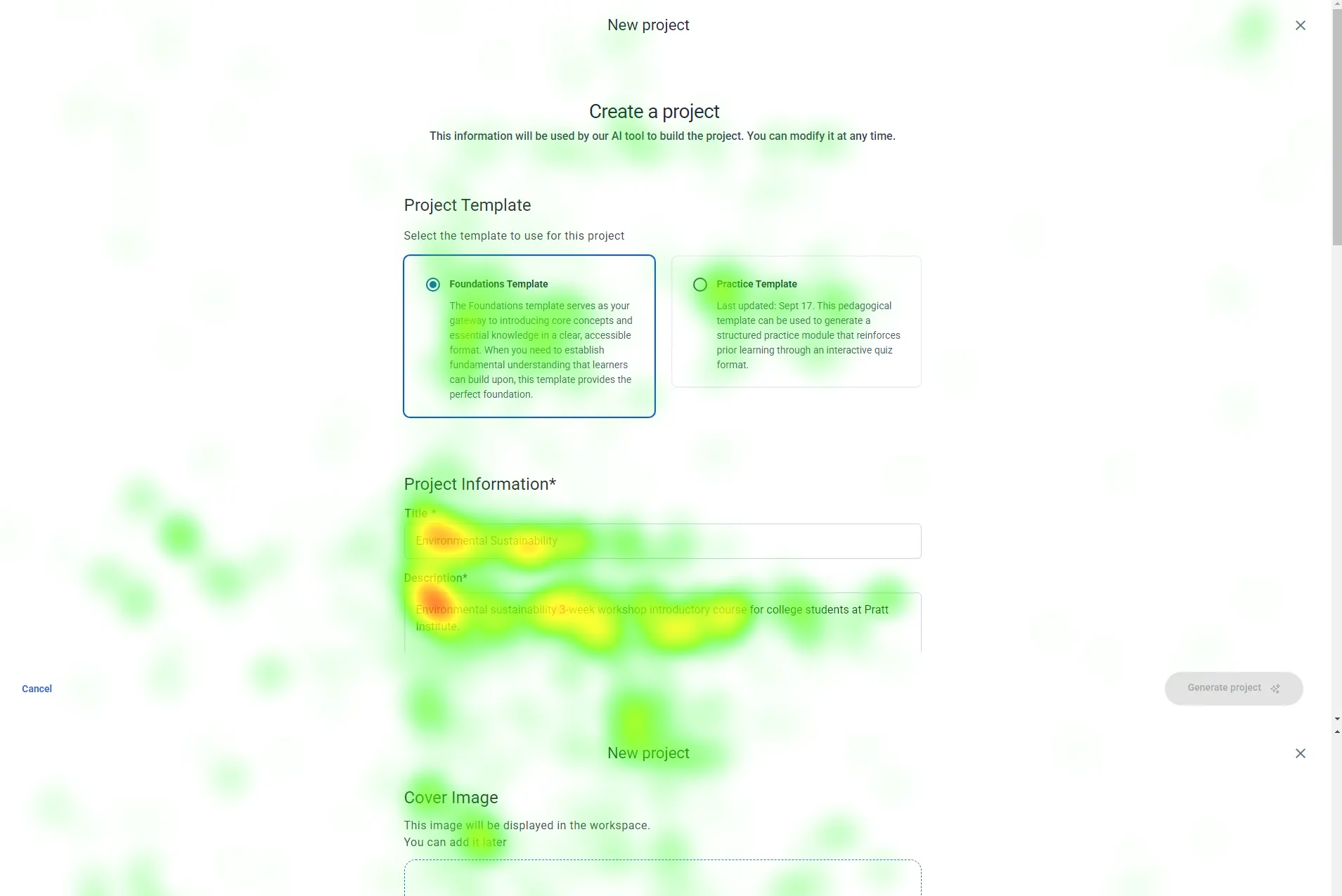
6/8 Participants debated between the two new project buttons on the first page.
“I felt like the sidebar button was grouped with something else… I clicked the one in the center because I thought it would be the right action” — Participant 3

We recommend moving forward with just one create project button in the center of the page, with a plus icon indicating something new.
All 8 participants expressed uncertainty and growing impatience during the module generation process. Without any indication of progress, users felt unsure whether the system was working, how long they needed to wait, or if they should refresh or restart the task. This lack of feedback created frustration and reduced confidence in the feature.
Introduce a clear loading bar with an estimated completion time, giving users a sense of progress and setting accurate expectations.This reassurance helps reduce anxiety, improves perceived speed, and overall creates a smoother, more transparent experience.

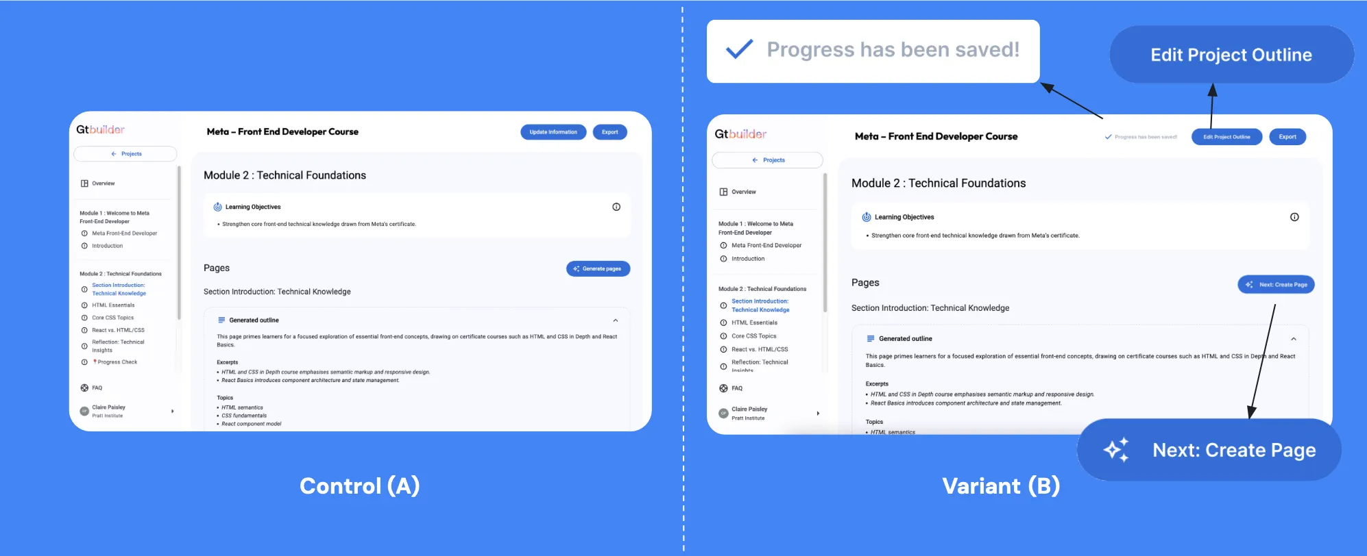
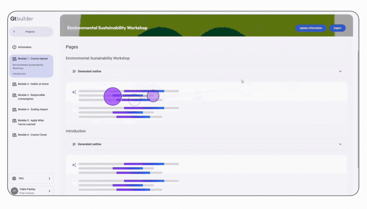
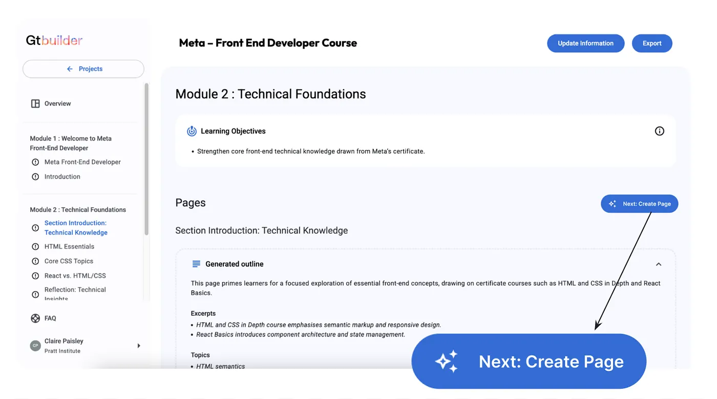
6/8 participants hesitated to click the “Generate Page” button, some even skip the button because they’re unsure if it is the correct next step and its purpose.
“How do I edit it? Should I just generate the pages? ”- Participant 2

Introduce a clear loading bar with an estimated completion time, giving users a sense of progress and setting accurate expectations.This reassurance helps reduce anxiety, improves perceived speed, and overall creates a smoother, more transparent experience.
7 out of 8 participants noted during the RTA that when updating a course module, they didn’t want to overwrite the existing content. Instead, they preferred the ability to duplicate the current version before making changes.
“I would prefer to duplicate the project instead of overwrite it… I like to see my progress” — Participant 2
Introduce a Version History section that automatically saves previous iterations and allows users to revert to an earlier version whenever needed.
An A/B test can help determine whether updated button wording (“Edit Project Outline,” “Next: Create Pages”) and the addition of a “Save” status indicator measurably improve user clarity and task success.